Redrawing an artwork (Art Journal #2)
Did you know? Redrawing a professional artist’s illustration is a great way to learn their techniques. That's exactly what we're doing in this post.
Hi, there! Harshini here.
Welcome to the 2nd episode of the Art Journal series!
In this newsletter series, you get to see my recent drawings, the process of creating a digital illustration, and some tips as well.
The previous episode:
This time, I redrew a nice picture I found on Pinterest. It turns out it was a repost from Twitter (X). So, I found the original artwork to credit the artist properly: Link to the original artwork/reference
I spent way too much time, literally days drawing this. It wasn't easy to do the line art but drawing this picture greatly helped me improve the quality of my lines. I’m using the eye dropper tool to color (I'm not ready to learn color theory yet).
In this post, I scattered some tips, and the things I learned while drawing this illustration. So, hopefully, you can learn some new things as well. (Although I think these tips may seem obvious to professional artists).
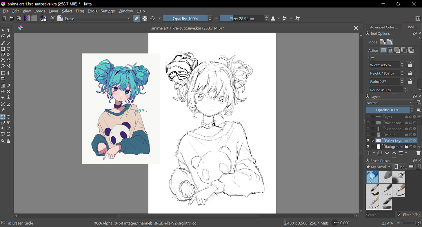
Rough sketch:
Usually, sketching out the bigger shapes or sketching the character “Base” will help you get the pose accurately. A “base” is a simplified version of anatomy. It usually looks like a mannequin you see at clothing stores.
Tip #1: Learn to draw a simplified version of anatomy or block out bigger shapes.
But… for some reason, I didn’t draw the bigger shapes or the base, and I don’t remember why. I directly sketched on everything including the smaller shapes like her earrings and hair strands. I don’t recommend doing that.
(Her hair on the left side looks different from the rest because I accidentally used a different brush. I left it be because it’s just a sketch anyway).
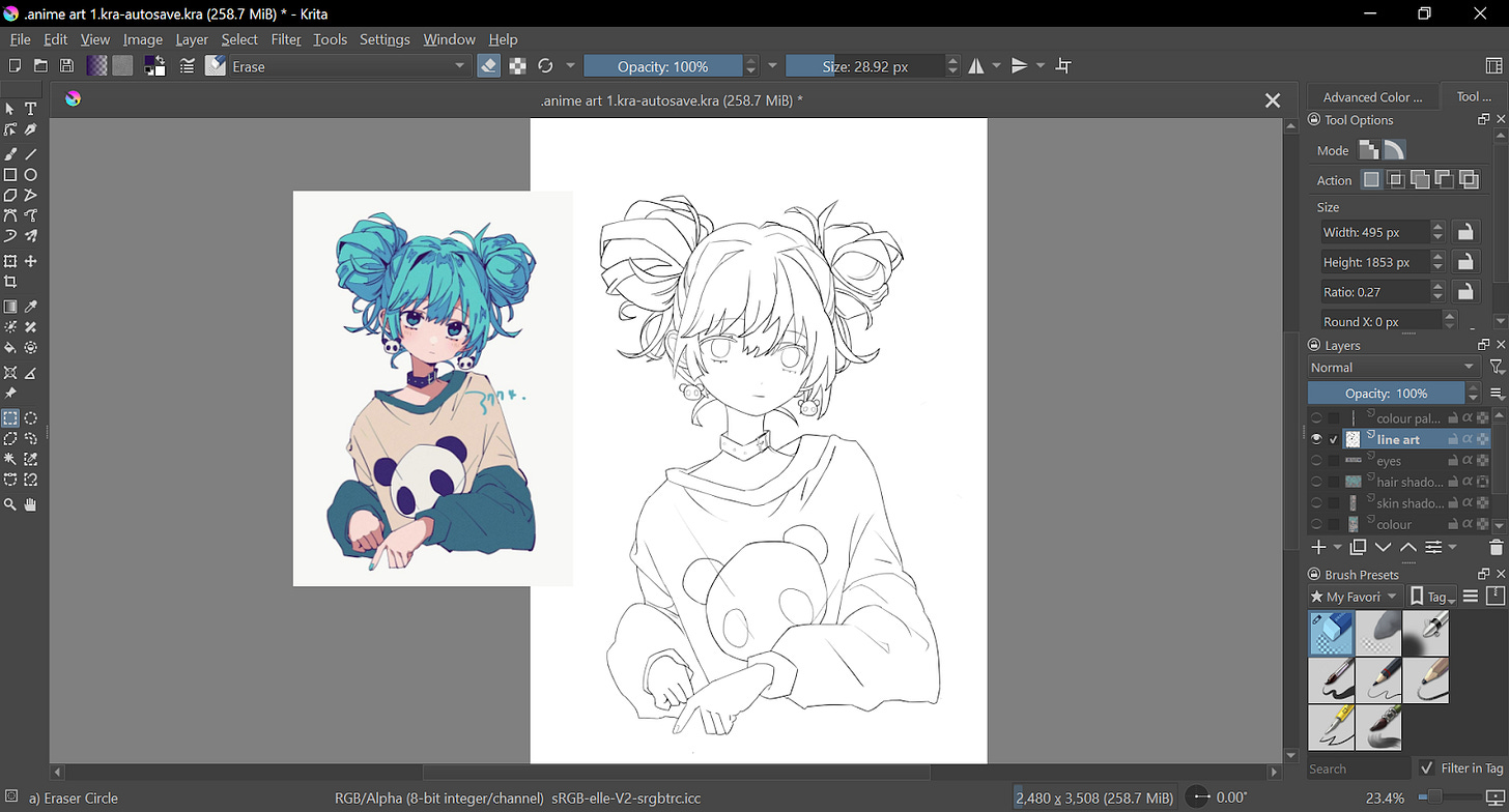
Line art:
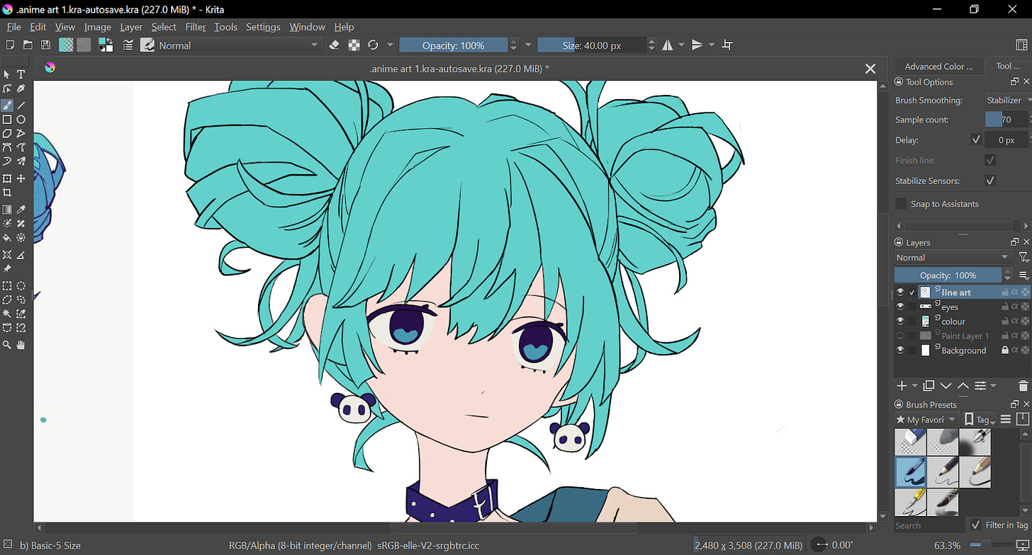
I lowered the opacity of the sketch layer, added a new layer, and named it “line art”.
Tip #2: Always name your layers.
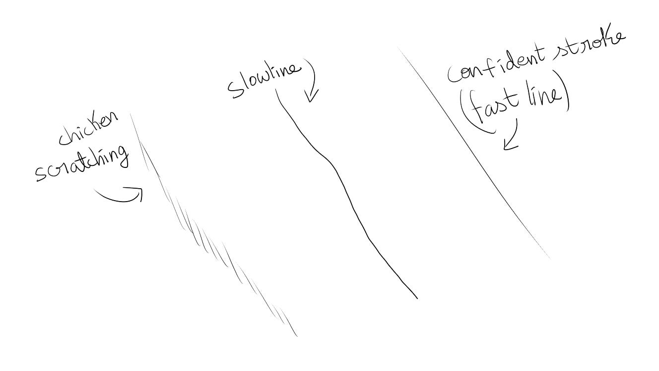
I tried not to do “Chicken scratching” and tried to do confident strokes that flowed smoothly. If I try to draw each line too slowly, it gets wobbly.
Tip#3: Draw confident and longer lines when doing the line art.
(Note: Messy lines are okay if they are intentional. They can make up a unique art style too.)
Here’s how it turned out:
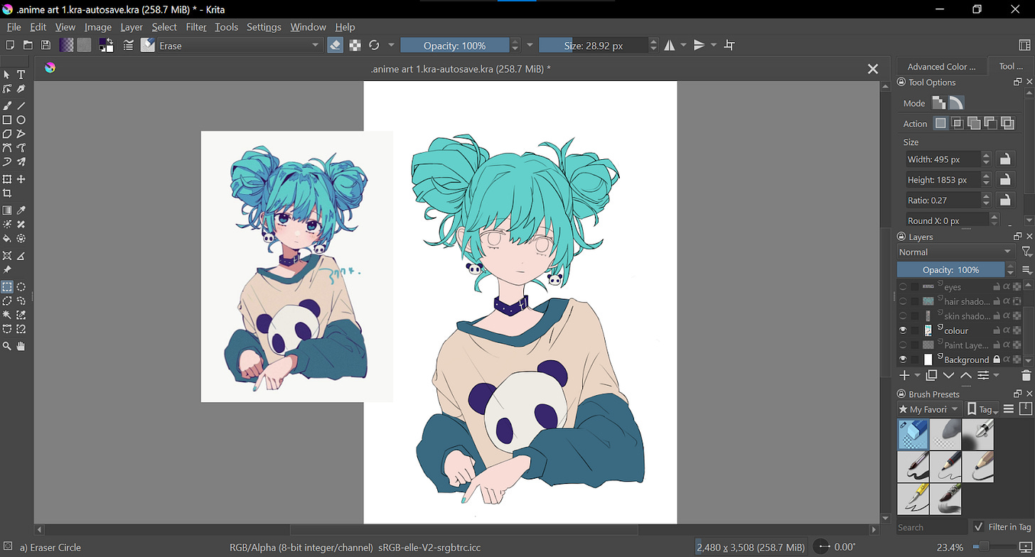
It’s coloring time!
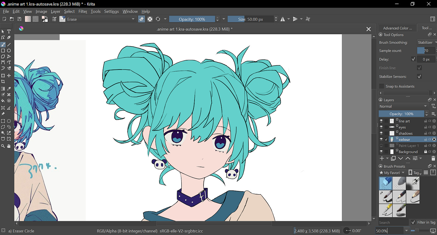
I filled in the flat colors first. I used the brush tool to outline the insides and then used the Bucket tool. That way, the colors won’t spill out even if you have gaps in your line art. I learned this from an artist named Rinotuna.
I like to do the eyes in a separate layer.
She looks disappointed in me for taking so long to draw her (lol). Let’s add some highlights to her eyes.
Now she doesn’t look depressed anymore. It’s intriguing how a few white dots can change the whole aura of the character.
Tip #4: Don’t add highlights if you intend your character to look sad, depressed, heartless, evil, or hypnotized.
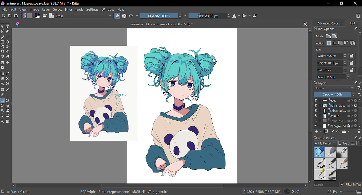
Time for some shading!
I shaded her like how she looks in the reference picture. I also added some lines to the lineart layer (because I forgot to add them before).
Finishing touches:
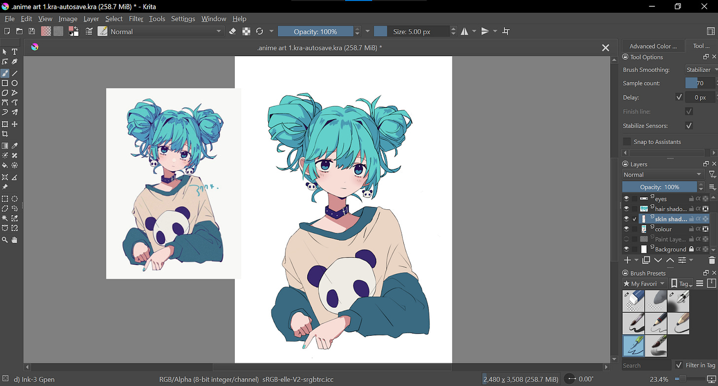
There is nothing more to add except one detail. This is when I discovered the ✨airbrush tool✨. I used it to add a subtle blush to her cheeks.
And it’s done! Take a look:
Though I just re-drew a picture, I like how it turned out. If you enjoyed this drawing process, feel free to drop by my Instagram page to leave a like or comment: view on Instagram.
Some details:
Tool: Wacom One pen tablet
Software: Krita
That’s it for this episode of Art Journal. If you liked this post, I hope you can let me know by leaving a quick like, comment, or share this letter with others.
Thank you for reading! I hope you enjoyed reading this post and I hope it was helpful. Come again next week on Friday for a ✨new post✨
Recommended newsletters to read next:




I appreciate you taking us along your journey with this series and wish you the best as you progress in your art