
Avoid these 3 sketching mistakes to improve your art skills (Art Journal #3)
In this episode, we are redrawing Ryomen Sukuna, an antagonist from an action anime, Jujutsu kaisen.

Hey there!
Welcome to the 3rd episode of the Art Journal series!
In this newsletter series, you get to see my recent drawings, the process of creating a digital illustration, and some tips as well.
The previous episode:

As an aspiring artist and an admirer of anime artists and animators, I can’t help but want to draw one of my favorite characters. And so, I did.
As we move along the process, I will share three sketching mistakes you can avoid to make your artwork look professional. And I’m going to show you the rest of the process as well.
Note: These are not must-follow rules, they are just helpful tips to help you improve faster.
This is a copy study, which means that I'm going to be redrawing a scene and not going to be creating an original artwork. Copying the artwork of a professional can teach you a lot more than most people think.
I intend to redraw illustrations until I get comfortable with drawing digitally. (I started digital art just this year after all). With enough practice, I’ll be able to draw from memory like the professionals too!
This time, I didn’t think much about what to redraw, I just saw this pic on Instagram and thought it would be cool to redraw it.
With that said, Today we are redrawing Ryomen Sukuna, a demon from one of the best action anime, Jujutsu Kaisen. Let's go!
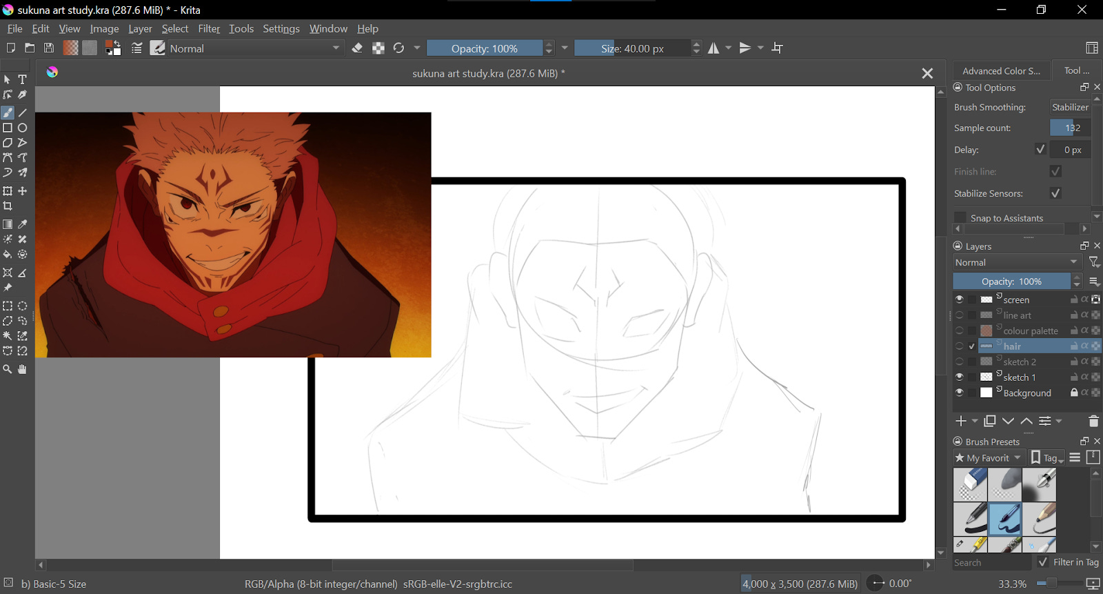
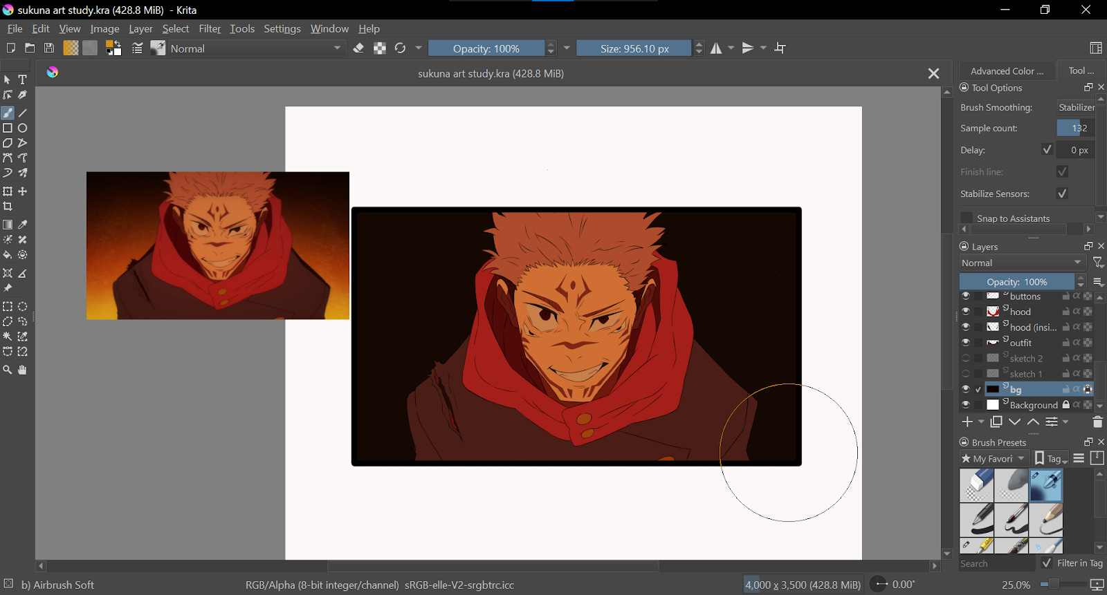
Rough sketch:
The picture you see at the top left corner is the reference image, a screenshot from Jujutsu Kaisen season 2. For my first layer, I blocked out the bigger shapes very roughly.
Sketching mistake #1: not focusing on the proportions.
Getting the proportions to be accurate can be a bit difficult for beginners. And that is exactly why you should focus more on that part and try to improve. proportions are an important part of the art fundamentals. Try focusing on the proportions of each part of the drawing when sketching rather than focusing on the quality of the sketch. How big is the head when it's compared to the body? Is the nose closer to the eyes or is it closer to the mouth? Think about each part of the drawing and compare them while doing the sketch.
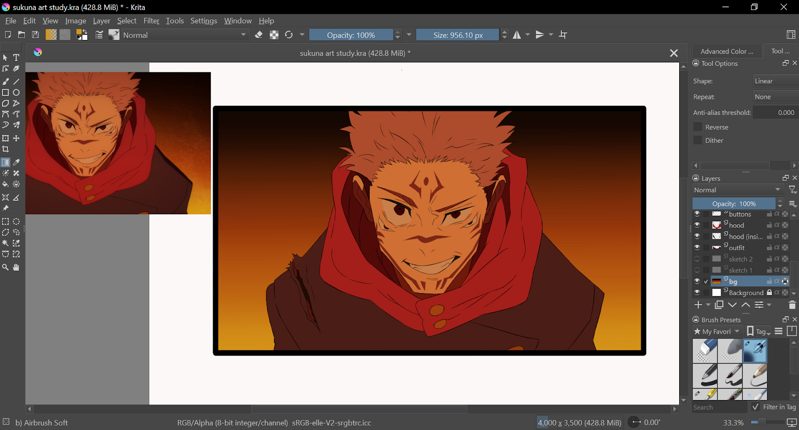
Detailed sketch:
For the next step, I created a new layer and named it “Sketch 2”. I will be drawing a more refined sketch in this layer.
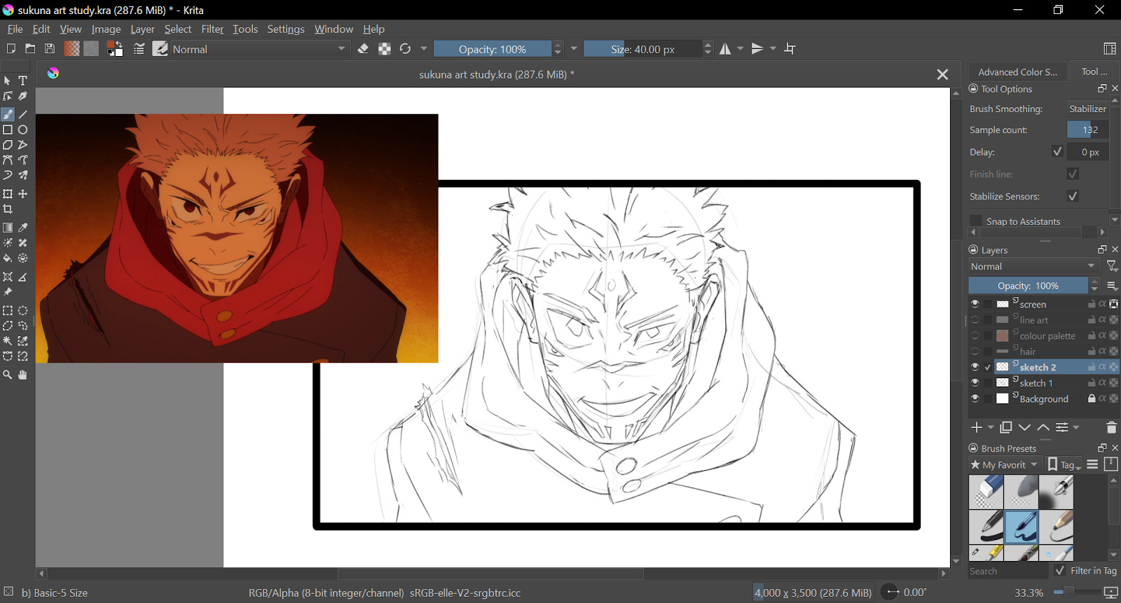
However, I made a mistake when drawing this layer which leads to-
Sketching mistake #2: spending too much time on refining the sketch.
A clear and well-defined sketch will help you do the line art without confusion. Sketches can be messy too. As long as you don’t get confused, it’s a good sketch. It's there to help you do the rest of the drawing so that it won’t end up looking wonky.
I spent way too much time on the sketch. I didn't put much thought into what I was drawing while I was sketching. I ended up spending way too much time and effort improving the quality of the sketch. The sketch is not even going to be present in the finished artwork-
Sketching mistake #3: looking at the lines instead of looking at the shapes.
Beginners tend to focus way too much on how each line is shaped that they neglect to look at it as an overall shape. That is a huge drawback. It defeats the whole purpose of doing a copy study. Look at the shapes and try to imagine how the shapes would look in 3D.
In this drawing, if you look at his hood as a 3D shape, you will notice that his hood is shaped like a big donut. The folds are continuous, but the lines are broken into several parts to make it look more natural and not cluttered and cartoonish.
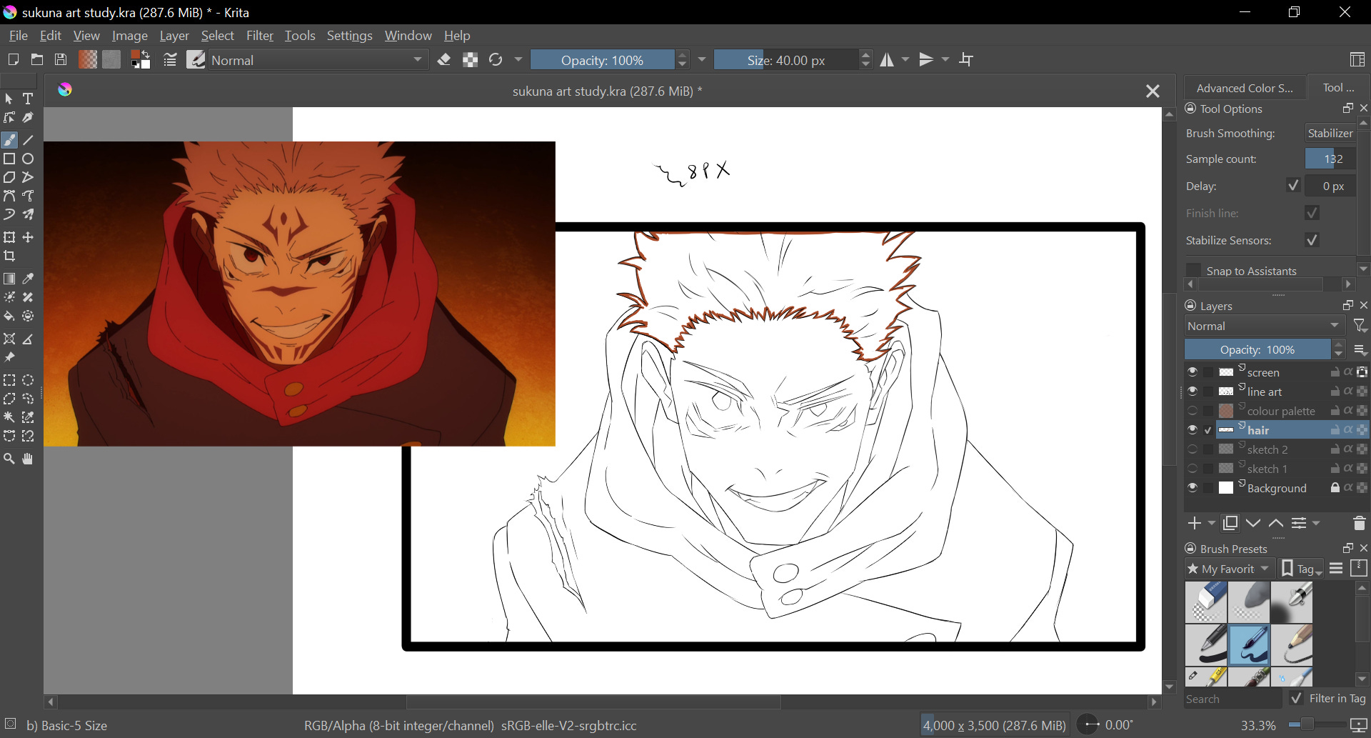
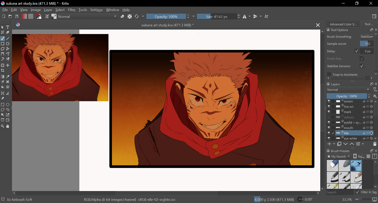
Adding line art:

I used the G-pen at 8 px for the line art. Sometimes I forget what size of brush I used, so I wrote it there as a reminder.
I didn’t draw the marks on his face because, if you observe the reference image, it doesn’t have an outline. I will be directly coloring the mark later.
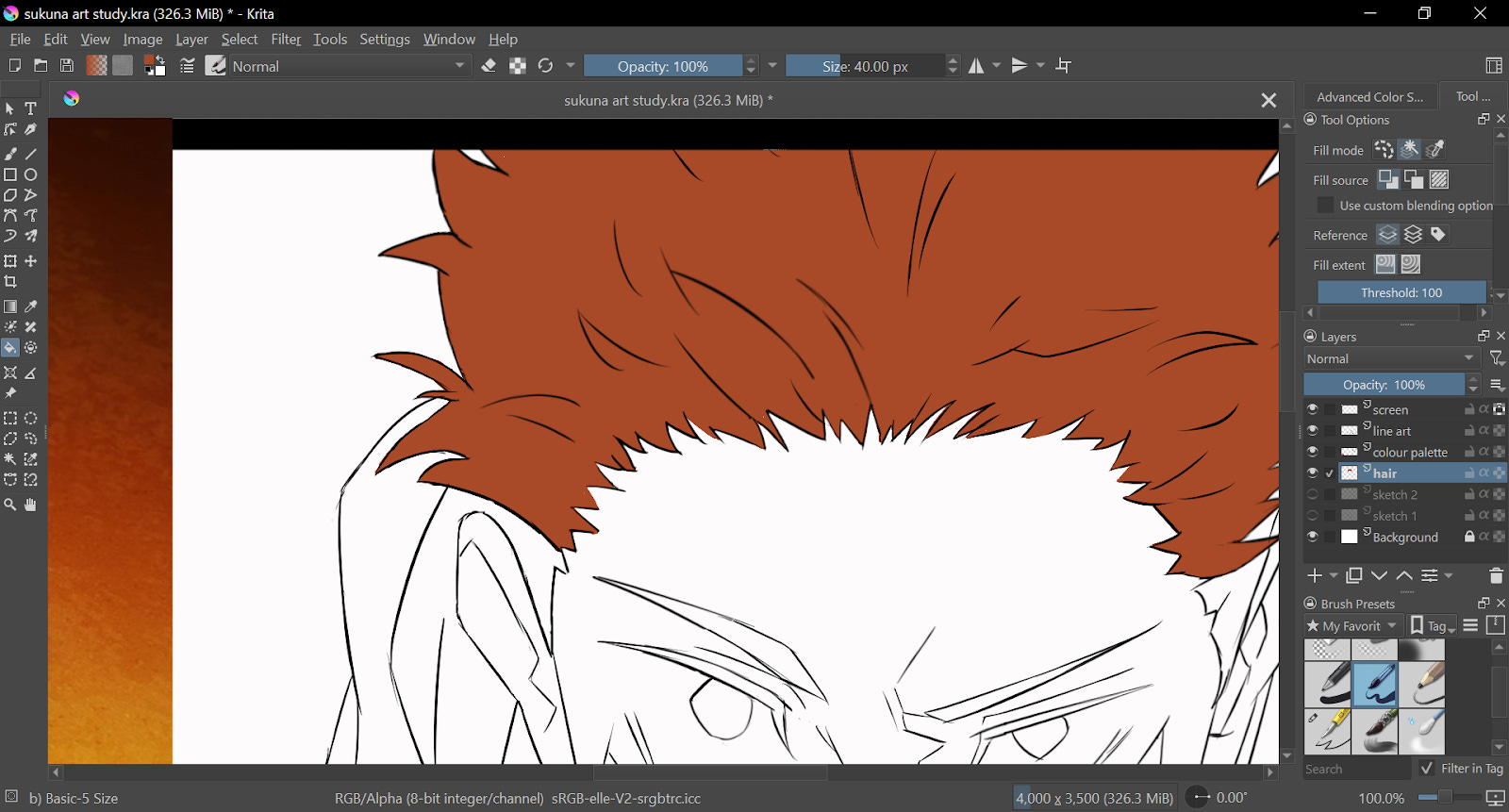
Adding flat colors:
After the line art, I used different layers for each part of the drawing. A separate layer for hair, a layer for his hood, etc.
Using the bucket tool won’t work because of the gaps in the line art so, I outlined the shape with the color and then used the bucket tool. Another way you can do this is by using the lasso tool to select an area and then using a big brush or the fill tool to add flat colors.

If the color has some gaps like in the above picture, try increasing the threshold of the fill tool and use it multiple times on the same area.
Okay, I went ahead and colored the rest of the drawing with flat colors. I colored the mark on his face as well.
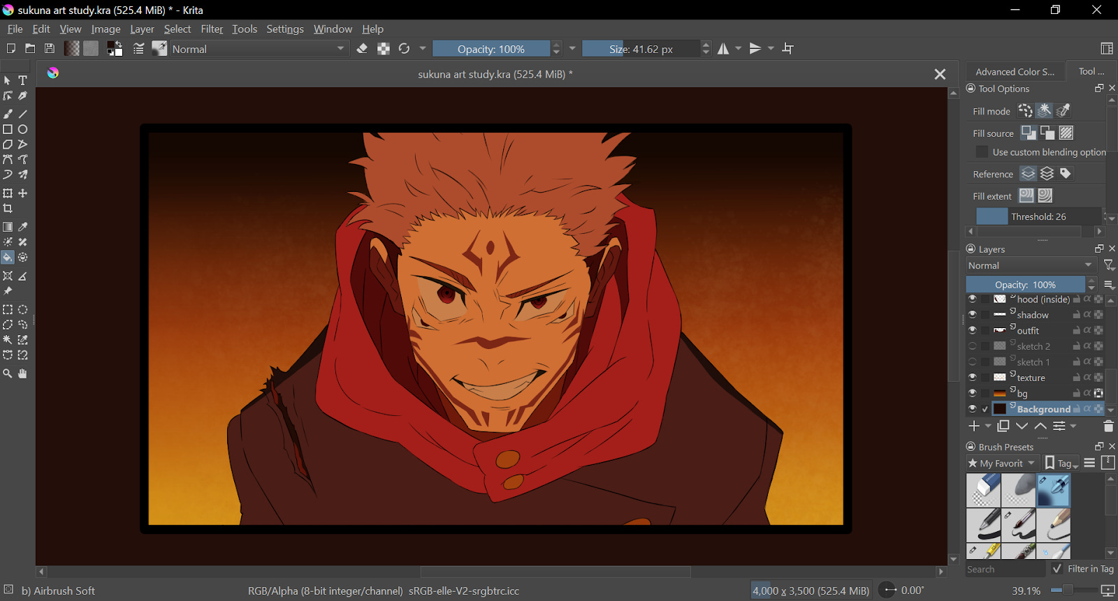
Background:
I used the gradient tool and used it two times for the lighting on the background. first, I added an orange gradient going upwards from the bottom. And then, I used a yellow gradient. The yellow one was shorter than the orange one.
Finishing touches:
It took some time to find the right brush for the texture in the background but I found the fitting one and lightly added it on top of the gradients.
I also added the shadows on his shoulder and a bit of glow to his eyes.
In this scene, the animators did not add highlights to his eyes because they wanted to portray his personality as a cruel and heartless character. You can also make the characters seem like they are depressed or disappointed by avoiding adding highlights to their eyes.
You can add highlights to a character's eyes if the character has a kind and innocent personality. You can also express positive emotions such as gratefulness, and happiness, or when the character is pleasantly surprised.
And it’s done! Here’s Sukuna from Jujutsu Kaisen.
I learned some new techniques when drawing this and it was fun! If you are learning art, I hope you will study the art from your favorite shows and learn some new things as well.
If you enjoyed this drawing process, feel free to drop by my Instagram page to leave a like or comment: I posted it on Instagram.
Some details:
Tool: Wacom One pen tablet
Software: Krita
That’s it for this episode of Art Journal. If you liked this post, I hope you can let me know by leaving a quick like, comment, or share this letter with others.
Thank you for reading! I hope you enjoyed reading this post and hope it was helpful. Come again next week on Friday for a ✨new post✨
Previous newsletters:


I thought they didnt add the highlight because they didn't have time for it 🤣
Now I wanna draw the same scene to see how mine turn out 😁
I don’t even draw but I love the way you share and explain, can tell that you’re passionate about it